Building the Machine: From Pipe Dream to Reality
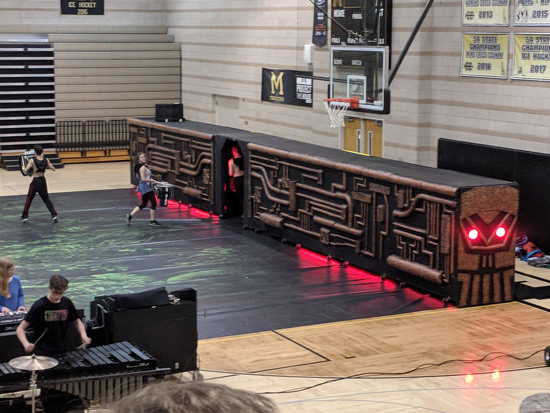
During my son’s senior year on his high school’s indoor percussion ensemble, I was asked to work on the aesthetics of the prop for the show. The show hadn’t been named yet, but in a Fern Gully type way the idea was that a massive prop that looked like a machine would move across the gym simultaneously picking up the floor (otherwise known as a gym-sized tarp on which the ensemble performed.) There were a group of dads who built the wooden frame with 2x4s into 8 - 6’ x 6’ x 3.5’ sections. It was a 48-foot-long beast. The top of each section was covered with plywood, and the fourth section from the back was made into a doorway. The sides and the front of the structure were mine to transform. Discussions began in December. I started my part in January. Competitions began mid-February. Production could be a process, but it needed to be completed by state competition in early April.
I had a lot of latitude with the design, but I wanted to make sure it would fit with the vision the Percussion instructors had. From my previous indoor percussion experience, I knew I had certain parameters in which I should work:
The panels were going to have to be light enough to load onto and unload from the truck and transport on the frames from the lot to the venue.
They were going to have to be sturdy enough to last a season of being regularly manhandled (or rather, teen-handled, which might be worse).
The panels and whatever materials I would use to embellish them would need to be secured, reinforced, and weatherproof to handle possible wind, rain, and snow for the time when they would be outside being assembled in the lots, pushed to the venue, and brought back to the truck.
Additional suggestions I got from the Percussion instructors included the following:
Embellishments should look machine-like although the prop didn’t have to be identifiable as a particular type of machine
The machine should look somewhat ominous or nefarious possibly with a little bit of steampunk edginess
So I started gathering inspiration like I have for past projects by setting up a Pinterest board. Because this board was for a competition, I set the board to secret and invited people to join. Pinterest had updated since the previous year, so I could now split the board up into different areas.
I made a mockup using an image of the structure. I used textures from different pipes kind of like what I saw on industrial machines. I added a red glow like an undercarriage light. My impressions were that the panels were going to have to go together. Individual panels looked too disjointed. The panels were also going to need to have some 3D elements like a relief sculpture so that the prop didn’t look like a boxcar. I did really like the red light, so that was staying.
My second mockup was based on an image of an engine. It was going to have to be modified, but the large continuous pipe at the top was going to stay, and I thought leaving the bottom portion plain would make it look like it was curving in a bit and it would keep whatever got added to it from getting kicked off.
We liked an intricate circuitboard/pipe texture I had pinned, so I used it to mock up the panels.
I made a side view to apply the texture. Even though there were 8 frames, one was a doorway. So I really only had to apply the texture to 7 panels. I started with the panels at the back, 8, 7, and 6. Five was the doorway. Then I reflected the design to panels 4, 3, and 2. And I would build up to something on panel 1 that would continue onto the front.
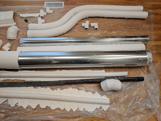
We made a number of trips to Lowe’s, and got inexpensive items that could be used as forms for rigid wrap. The process was fairly tedious and it was taking over my house. So I enlisted the help of other parents to do some more rigid wrap at the middle school where our students practiced.
The next step was filling the forms with expanding foam. It took a lot of foam and a lot of time. Once the foam was dry, it then needed to be cut flat.
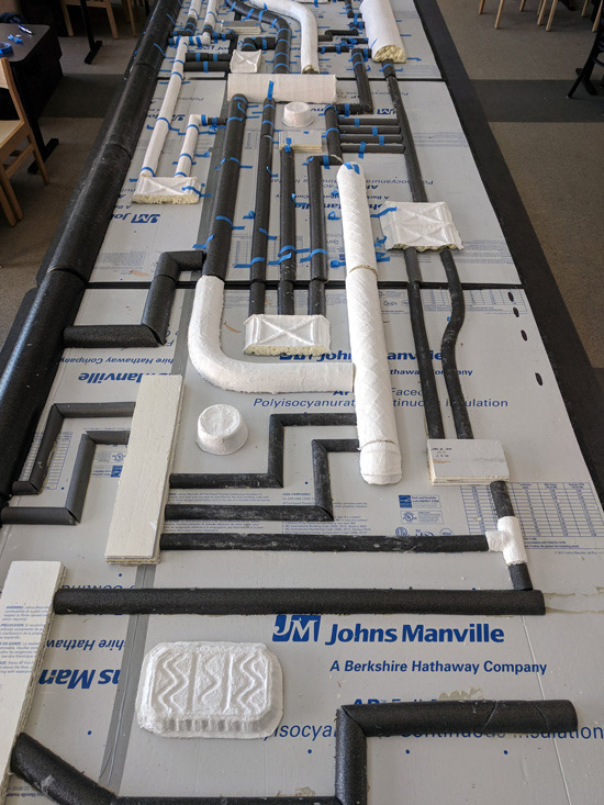
It was clear that the time it was taking too long to make all the pipes and because we had more budget we could use, we bought pipe insulation, 2 sizes of pool noodles, and foam rollers.
To keep the weight down, we used foam insulation board instead of plywood. The sheets only come in 4’ widths, so additional boards had to be cut and taped to make the 6’ x 6’ panels. Because of the structure, the panels had to be that size, but it made it so that we couldn’t fit them in our car. Which meant I couldn’t take them home to work on. I had to use the school. We also had to use the marching band trailer for our storage, so whatever I didn’t get laid out and glued down had to be taped.
Fortunately, the directors decided that along with the plain black backside of the tarp that would show when the prop picked it up, the back panels would also be black. It was to symbolized the destruction of the forest. So other parents painted those panels while we moved from the band room to the student center which had tables, so it wouldn’t hurt so much to keep working on the floor.
But it was taking a while to get panels done. It wasn’t really possible to do a direct translation of the pipe pattern, so I only used it as inspiration. The work intensive project and its logistics meant we were behind schedule. It was okay not to have the panels for evals which is an opportunity for the judges to get an idea of what the show is in order to give recommendations, but the prop didn’t look that menacing when you could see the drummers inside pushing it.
We had hoped to have the panels for the ensemble’s exhibition run at the Winter Guard festival. We did have a roof, so now it was more of a gazebo.
By the first competition, we had the 3 back panels done. I wanted to start with the back in case it didn’t look very good, I could improve my technique for the panels that were nearer to the front.
Because the 3 panels were done, the other helpers could cut the reflection and lay those out while I worked on the design for panel 1.
I had discussed with the directors an idea I had to make the front like a face to personify the evil machine. I did a mockup using a picture I had taken of one of the completed panels. And this is how it turned out.
We primed the panels to make sure the paint would stick. Then we painted them black.
We had the whole prop covered by Regionals, and we were getting the system for assembling in the lot worked. It was looking good, but it was all black.
We needed some contrast to make the pipes show up more. We had already been talking to the directors about adding some rust, so I did mockup.
I used a combination of a natural sponge and a damp towel to apply splotches of paint. I was able get clearance paint at Lowe’s for a huge discount, and they let me add some pigment to get close to the colors I wanted. I even got to add metallic silver flecks to the gray. So I put down a layer of the light gray. Then I added the darker red. And then I added a light gold.
Adding the rust look was one of many projects planned for Spring Break. Another was to address the plain black on the back. The feedback from the judges was that they didn’t understand it. It looked unfinished to them.
This was my response. The directors had earlier talked about making it look more steampunk and adding gears. My initial reaction was that gears were often associated with innovation and progress. I wasn’t sure that would communicate the right idea.
So I thought more about it, and tried to think of what would make gears look evil. Well, fire maybe. I pinned this image for inspiration. But this image wouldn’t work. It was too rectangular. I had to make something 48’ x 6’. By itself, the fiery gears still didn’t seem menacing enough.
I thought about the uniforms that had feathers on one shoulder--something the judges also didn’t understand.
So I decided we needed dead birds.
While I was working on this mockup, I heard from the director who had just seen the fiery gears. He said he’d love it if I could make something based on that. I was already on it. Gears, fire, dead birds, oh and dripping blood on the gears just to make sure that it was clear it was evil.
We were able to get it printed on tarp fairly quickly. We allowed a little extra at the bottom as a mudflap to cover the wheels and the bars with hooks that dragged the floor. Once it arrived, it needed to be cut, attached to the panels, and the overhang needed velcro so that it wouldn’t drag during transport in the lot.
We got round programmable LEDs for the eyes. Placement is important, otherwise they look like googly eyes.
Without a covering, the LEDs were really noticeable. We wanted them to runthere was transition in the show when the students go through the prop as they are lured by the greed of industry and that’s when the LED runners at the bottom and the eyes turned on. We wanted the LED runners at the bottom and the eyes turned on at the transition in the show when the students go through the prop as they are lured by the greed of industry. So I picked a thin black fabric to cover the full eye area. You couldn’t see the LEDs until they were on. And when they were on, they were still really bright.
The last step I had to wait until it was warm enough outside to do. It was applying a top coat of pearl orange Plasti Dip which made it look more metallic.
The prop was ready for the Friends and Family Show.
At this point a lot of time had gone into making the prop, but the forecast for state was cold and windy. One of the dads enlisted some help to build this container to protect the panels.
We successfully kept the panels out of the wind and assembled sections to move to the venue. Notice the headlamp. It was dark inside.
The prop and the ensemble looked great at State! But, they took 3rd place. I mean, yay, they took 3rd place.
Then we were off to Dayton, Ohio for WGI - the World Championships.
We made some final tweaks to the prop including replacing the black fabric at the door with the printed piece and cut windows into it, which made it look better from a distance.
The prop was ready for the prelims, but the ensemble missed getting into semi-finals by a fraction of a point.
So the rest of the time we enjoyed watching the world-class and open-class ensembles.
We had amazing seats that were right next to the judges down in front. Thomas got to meet his idol, Scott Johnson, Percussion Director for the Blue Devils, who liked our prop! And Thomas not only got his autograph, this pic was tweeted out and shown on the main screen.
One of the kids had a birthday during our trip. You know your design is good when they put on a cake.
It was a huge undertaking and one of the largest props there, except of course for the Independent World ensemble, Stryke Percussion, that brought a plane.